

Table of Contents
Your reward model learns your raters
Here is the part most teams skip past on their way to the fun bit.
A reward model only ever sees one thing: which of two answers a human clicked. It has no access to whether the answer was correct, helpful or safe. Twenty thousand clicks go in, and a function that predicts clicks comes out. Whatever your raters were doing when they clicked, that is the thing you have trained.
So if they lean toward longer answers, you have built a length maximiser. If they lean toward confident phrasing, you have built a model that sounds certain on questions it should be hedging. Almost every complaint people have about aligned models, the padding, the flattery, the four-paragraph answer to a yes-or-no question, started life as somebody’s click at 11pm on a Tuesday.
I find that framing useful because it moves the quality question upstream. The fix for a bad preference dataset lives in the rubric, the rater pool and the interface, well before any RL algorithm gets involved.
It also explains where annotation money is going. Basic labelling has been squeezed hard by model-assisted pre-labelling, and spend has moved toward preference data, evaluation and red-teaming. The revenue figures make the point better than any forecast: Scale AI booked roughly $870 million in 2024, Surge AI around $1.2 billion, and Mercor hit $500 million annualised by October 2025, per Herohunt’s overview of the data labeling industry. Vendor forecasts put the narrower RLHF platform segment at about $2.8 billion in 2025 growing to $18.6 billion by 2034, a 23.2% CAGR, in a DataIntelo market report that gets quoted widely, including by Lemon.io. Treat syndicated forecasts as directional and lean on the revenue figures, which are the load-bearing evidence here.
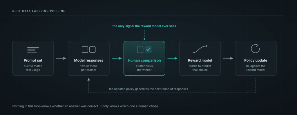
The four data types in an alignment stack
People say “RLHF data” as though it names one thing. There are four kinds, and each one wants a different rater, a different guideline document and a different line in the budget.
Demonstrations, the SFT data, are humans writing the ideal response from scratch. This is the expensive one per unit, because writing takes longer than judging, and the ceiling is set entirely by the writer’s own domain skill. A mediocre writer produces mediocre training data no matter how good your QA is.
Preference comparisons are the core of RLHF data labeling: a rater picks between two or more model responses. Cheapest of the four per unit, which is exactly why teams over-order it and under-specify it.
Evaluation sets are held-out prompts with adjudicated answers, used to measure the model rather than train it. Small, expensive, and worth the money, because they are the only honest read you will get on whether any of this worked. Teams that skimp here end up optimising a number they cannot trust.
Red team data is deliberate adversarial probing and whatever the model coughs up in response. This needs a specific temperament, proper pay, and real psychological support when the content gets genuinely nasty. Please do not staff this casually.
The common mistake is running all four through one rater pool with one guideline document. Judging a red-team probe and ranking two summaries are different jobs that happen to share an interface.
Rule 1: Design the comparison before you write the rubric
Your comparison format constrains everything downstream, so decide it first.
Straight pairwise, A versus B, is the simplest and fastest, and it gets you the highest agreement. The cost is that it throws away information about how much better A was. A landslide and a coin-flip look identical in the data.
Pairwise with a margin adds a strength rating on top. Slightly slower per item, meaningfully more signal, and in my experience the right default for most teams.
Ranked lists of four to eight give you more signal per prompt. Rater fatigue climbs sharply past four options though, and agreement degrades along with it. Use them when prompts are expensive and raters are experienced.
Likert scoring each response independently lets you compare across prompts, which sounds appealing until you see how badly absolute scores drift between raters. One person’s 4 is another person’s 6. Relative comparison beats it almost every time.
Whichever you pick, handle ties explicitly. If you force a choice between two genuinely equivalent responses, you are injecting noise and labelling it signal.
Rule 2: Prompt distribution beats prompt volume
Twenty thousand comparisons drawn from a narrow prompt distribution will teach your reward model a narrow lesson very thoroughly.
Map the intended usage first, then build the prompt set to match it: task types, difficulty spread, adversarial share, language mix, domain coverage. Then deliberately oversample where the model is weakest, because that is where preference signal has room to move the needle.
A reward model trained mostly on easy prompts becomes confident and useless on the hard ones. Those hard prompts are the only reason anybody was worried in the first place.
Rule 3: Write rubrics with worked disagreements
A rubric that lists helpfulness, honesty and harmlessness with one sentence each is a slogan with bullet points. It will feel complete right up until your first agreement report.
What works is dimensions with explicit precedence, plus worked examples of the cases that split people down the middle.
Precedence is the part teams skip. When a response is more helpful and less safe, which wins? When it is accurate and rude? Write the ordering down in plain language. Leave it out and every rater quietly invents their own ordering, and your agreement score will find out before you do.
Then take the ten hardest real examples you have, show both responses, state the correct call, and explain the reasoning behind it. Those ten worked examples will do more for consistency than five pages of principles. I would take a two-page rubric with good examples over a twenty-page one without them, every time.
Rule 4: Run a calibration round, always
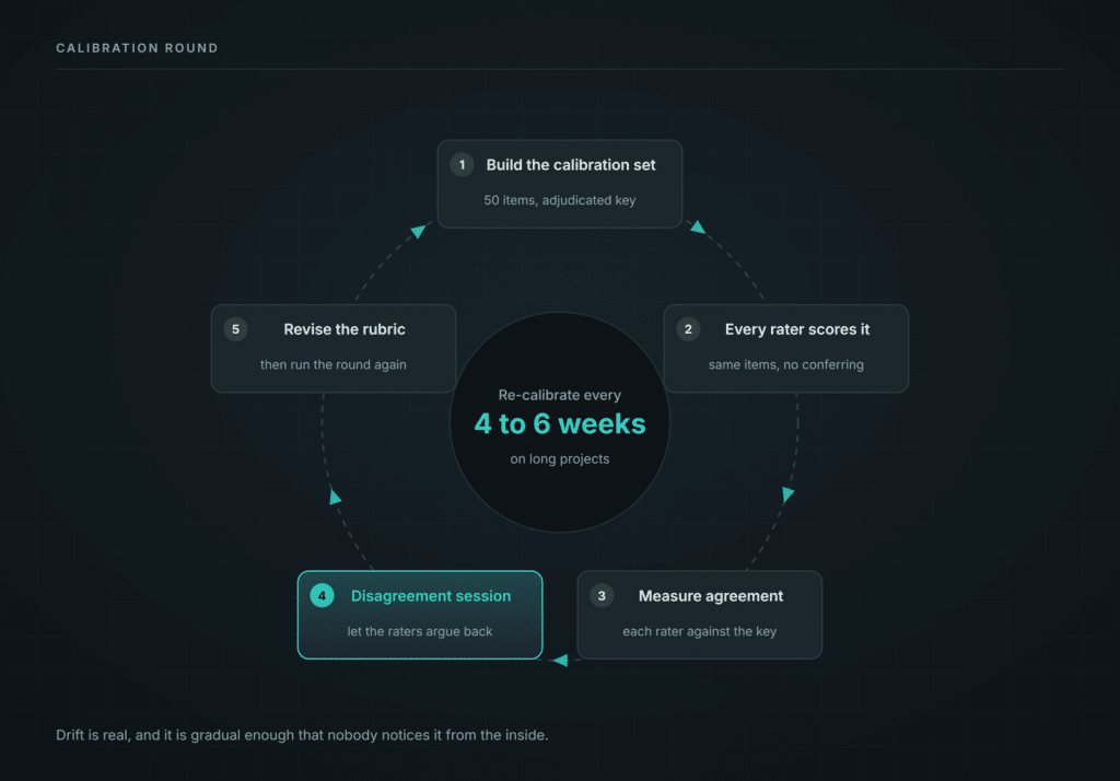
Before production RLHF data labeling starts, give every rater the same 50 comparisons and score them against an adjudicated answer key.
Then sit down with the disagreements and talk them through. Run it as a discussion where people are allowed to argue, because roughly half the time the raters are right and your rubric is ambiguous. If nobody pushes back in that session, either you have written an unusually good rubric or people are being polite. Assume the second one.
Two things fall out of this. You find the raters who are not going to work out, and you find the rubric gaps you did not know you had. Both are far cheaper to discover in week zero than in week six with 12,000 items already labelled.
On long projects, re-calibrate every four to six weeks. Drift is real, and it is gradual enough that nobody notices it from the inside.
Rule 5: Measure agreement, and expect a humbling number
Preference judgment is subjective, so agreement runs lower than on categorical labelling. Plan for that upfront and you will save yourself a panicked week.
The published numbers are useful here because they come from teams with serious budgets. In the InstructGPT paper, OpenAI’s training labellers agreed with each other 72.6% of the time, and held-out labellers 77.3%. In the earlier summarisation work, Stiennon et al. reported labellers agreeing with each other 72% of the time and with the researchers 77%, while the researchers agreed with each other 73%. Their own explanation was blunt: the comparisons are difficult and subjective.
On a binary choice, 72% to 77% raw agreement works out to a chance-corrected kappa somewhere around 0.45 to 0.55. So when you see a vendor quoting Krippendorff’s alpha of 0.9 on open-ended preference work, they are either measuring an unusually constrained task or measuring something other than what they think.
The trend matters more than the absolute number anyway. Agreement climbing through calibration and then holding steady means the process is working. Agreement sliding in month two means fatigue or drift, and it needs an intervention rather than a note in the weekly spreadsheet.
Which statistic to use and why is covered in data annotation quality metrics.
Rule 6: Control for length bias
Raters prefer longer responses. This one has a proper evidence base now, and the size of the effect is genuinely alarming.
Singhal et al. (2023) decomposed how much of the reward gain from RLHF comes from length alone. On WebGPT, roughly 98% of it. On RLCD, around 73%. On Stack, about 47%. They then showed that optimising for length by itself reproduced most of the apparent preference improvement from full PPO, hitting a 56% win rate against 58% for the real thing on WebGPT. Read that twice. On some datasets, “make it longer” was doing nearly all the work that everyone was attributing to alignment.
The same pattern shows up in automatic evaluation. Length-controlled AlpacaEval raised the Spearman correlation with Chatbot Arena from 0.94 to 0.98 purely by regressing out output length.
Three defences, and you want all three.
Track the correlation between response length and win rate in your own data from week one. Our working threshold at Annotiq is 60%: if the longer response is winning more often than that, you have a quantified problem rather than a vague worry.
Put it in the rubric in plain words. State that unnecessary length counts against a response, and include a worked example where the shorter answer is the correct call.
Seed your calibration set with length-controlled pairs where the shorter answer is clearly better. A rater who reliably picks the longer one needs a conversation, and it is a kind conversation to have in week one.
Rule 7: Randomise position
Whichever response appears first tends to win. In LLM-as-judge research the effect is well documented and sometimes severe. With human raters, the primacy effect from survey methodology points the same direction, though the RLHF-specific literature is thinner than people assume.
Either way, randomising costs you nothing, so do it. Randomise A/B ordering per item, then audit win rate by position. If position A is winning 55% across a large sample, your randomisation is broken or your interface is nudging people toward the top of the screen.
The same logic covers any consistent ordering, including model identity if raters can work out which system produced which response. They should have no way of telling.
Rule 8: Watch for rubric overfitting
This is the subtle failure, and it usually surfaces around month two.
Raters get good at your rubric. Then they get too good at it. They start scoring against the checklist rather than reading the response properly, and a reply that ticks every box while being useless starts winning comparisons.
The tell is agreement rising while your held-out evaluation scores go flat. Your raters are converging on each other and drifting away from the thing you actually care about. It looks like quality improving right up until you check the evals.
Two fixes. Periodically slip in comparisons where the checklist gives the wrong answer and see who catches it. And rotate raters across task types so nobody spends four straight months inside one rubric.
Rule 9: Buy expertise where the task requires it
General raters handle general helpfulness perfectly well. Ask them whether a clinical response is safe, whether a legal summary misstates a standard, or whether a Yoruba response actually sounds like something a person would say, and you are asking for a guess delivered with a straight face.
That is the real cost. A generalist on a specialist task produces confident wrong preference data, which is worse than collecting nothing, because it trains the model in an actively wrong direction with full statistical confidence behind it. There is a reason xAI reportedly cut 500 generalist annotators and shifted toward domain specialists in STEM, medicine and finance.
So budget for it. Specialist raters cost several times generalist rates, and on the subset of comparisons that need them, that is simply the correct spend. Work out which slice of your prompt set requires domain judgment, price that slice separately, and stop trying to average the cost across everything.
For multilingual work, native speakers are the only option that produces usable data, for reasons we go through in low-resource language NLP.
Staffing a 20,000-comparison RLHF data labeling project
Team. Eight to twelve raters, one lead, one adjudicator. Three raters overlap on 15% of items so you can measure agreement, single rater on the rest.
Week 0. Rubric drafting, a 50-item calibration set built and adjudicated, rater qualification round.
Week 1. Calibration, the disagreement session, rubric revision. Expect to change the rubric. If you come out of that session with it unchanged, you did not look hard enough.
Weeks 2 to 6. Production, with weekly agreement reporting and a mid-point re-calibration around week 4.
Week 7. Adjudication of the disagreement queue, final QA, delivery with a full agreement and drift report.
Throughput. A trained rater handles roughly 60 to 100 pairwise comparisons a day on general prompts, and considerably fewer on long-form or specialist content. Those are our own operating figures. Budget from them and treat pilot throughput as optimistic, because pilots always are.
What is RLHF data labeling?
Collecting human preference judgments on model outputs, usually as pairwise comparisons, then using them to train a reward model that guides reinforcement learning.
How many comparisons do I need for a reward model?
It depends on how broad your task is, but meaningful signal usually starts in the tens of thousands. Prompt diversity does more for you than raw count.
How many raters should see each comparison?
Full triple-rating is expensive and rarely earns its cost. Overlap 10 to 20% of items across three raters to measure agreement, single-rate the rest.
What agreement score should I expect on preference tasks?
Lower than categorical labelling. OpenAI reported 72.6% to 77.3% raw agreement between labellers on preference comparisons, which is roughly a kappa of 0.45 to 0.55. Anything much above that on open-ended work deserves a second look.
What is length bias in RLHF?
The tendency of raters to prefer longer responses regardless of quality. Singhal et al. found length explained up to 98% of the reward improvement on some RLHF datasets. Left alone, it trains models to pad. Measure the correlation in your own data and address it in the rubric.
Do I need domain experts for RLHF data labeling?
For clinical, legal, financial or multilingual content, yes. Generalist raters produce confident wrong preferences in specialist domains, which does more damage than collecting nothing at all.
How is preference data different from SFT data?
SFT demonstrations are humans writing ideal responses. Preference data is humans judging model responses. Writing costs more per unit; judging scales better
Run a pilot before you commit
We staff RLHF and evaluation programmes with trained, calibrated raters, including domain specialists and native speakers for multilingual work. Start with a 500-comparison paid pilot and read the agreement report before you scale anything.
Book a free demo, or look at our text annotation and AI consultation services.